Style Guide
What do I wear to my shoot?
This is a common question and is an important part of the photo shoot to consider, as it will have a big impact on the overall images. As a general guide, I recommend:
Colors
- Stick to the same TONES, but don’t overly match (don’t all wear blue jeans and a white t-shirt)
- Neutral colors are always good – use 3-4 neutral colors as your base, then everyone can use these to coordinate their outfits (e.g. grey, tan, cream, blue, lighter brown and white)
- Primary colors or versions of them, tend to work well (e.g. yellow/mustard, red/maroon, blue/navy/royal)
- When adding color, choose 2-3 main colors, and 1 accent pop of color
- Avoid fluorescent or really bright colors – strong colors can look great, but not fluorescent. If you wear strong colors, then make sure it’s more of a feature color rather than the whole outfit (e.g. mustard jumper with denim jeans), and avoid EVERYONE wearing a strong color
- Avoid Neons and Pastels and Opt for Muted or Dark Colors. In general, muted and darker colors work best in photos. Neon colors can cast color onto skin in photos, and really light colors tend to wash people out. Muted, soft hues, like soft pinks, browns, tan and ivory can serve as lighter neutrals without washing skin tones out.
- Avoid too much black where possible – especially if someone is in a lot of black, and someone else is in a lot of white
- Think about the location of your shoot – if you are at the beach, wear colors that you would see at the beach (e.g. white, cream, soft blues), if your shoot is in the park – consider contrasting with the greenery with warm colors such as red, oranges or yellows, in addition to some neutral colors.
- The key to coordinating outfits is that you want to compliment each other and not attempt having the same exact clothes. By doing this you create a cohesive look that has dimension and personality.
Color Pairing
- If you aren’t feeling super adventurous, one of the easiest ways to pick a fool-proof color palette is to put everyone in neutral shades (ivory, brown, gray, beige, etc.).
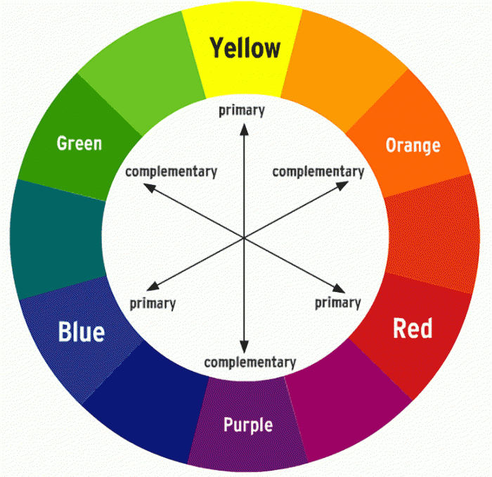
- You can also pick one main color and add in neutrals. If you’d like to add more color, you can introduce accents of coordinating colors. You can find coordinating (or complementary) colors by looking at color’s opposite shade on the color wheel. For example, if you choose navy blue, a coordinating color would be an orange tone. See below.
Patterns
- Avoid clashing patterns – patterns can be great, as long as not everyone is wearing them. Florals are beautiful for little girls and women. Stripes and spots can also be great, but stick to one person wearing them
- Avoid logos or writing on clothing
Style
- Textures and layers look great – think layers of a kimono/shawl over a tank top, lacy or textured material, textured beanie on a cold day, scarves and boots, t-shirts and jumpers, jackets and vests. Think about the style of clothes matching location (e.g. if you are in the woods, it may look out of place to be wearing heels and a fancy dress). With lifestyle shoots, wear clothes you would normally wear at home, without trying to match
- If you don’t know where to start, pick one outfit you really love, and style the rest of the outfits around that
- Make sure you (and everyone) feel comfortable in your clothes. Show off your personality in your clothes – don’t feel that you need to dress plain if your personality and style is eclectic – you want the photos to represent the real YOU
- Think about your shoes – if you’re wearing a nice dress, pair it with a nice pair of wedges, boots or heels – not old thongs or sneakers
- The most important thing is to feel comfortable in your choices. There is no need to go and buy a new outfit (although it’s always a good excuse if you’re looking for one!)
Feel free to contact me for further help, or send me photos of clothing you’re considering. It can be challenging styling your photo session- but also lots of fun!